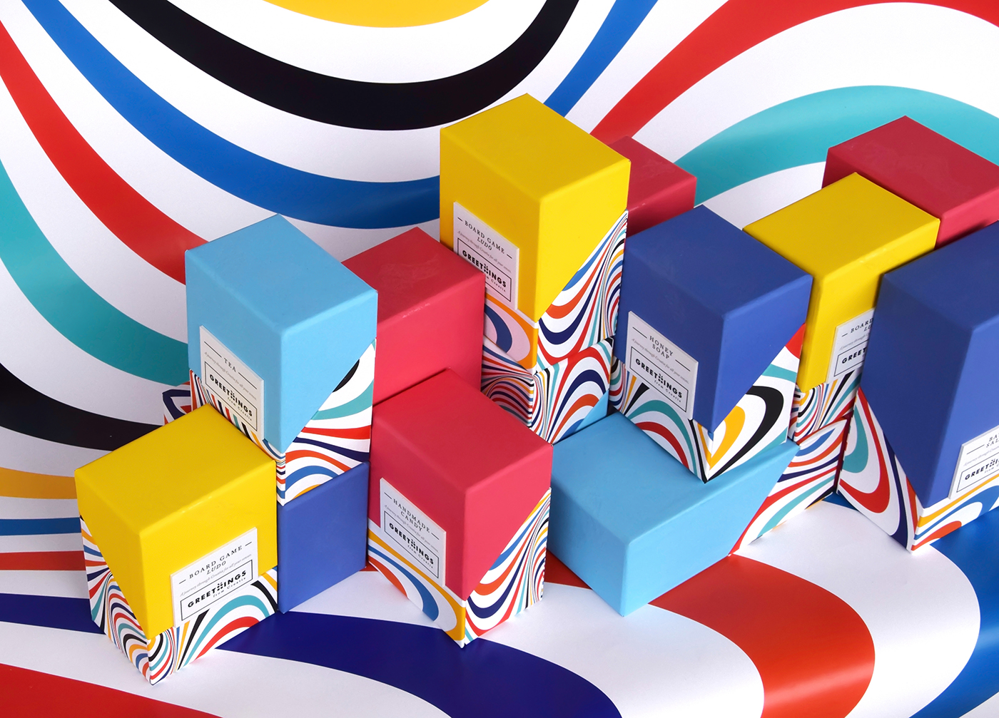
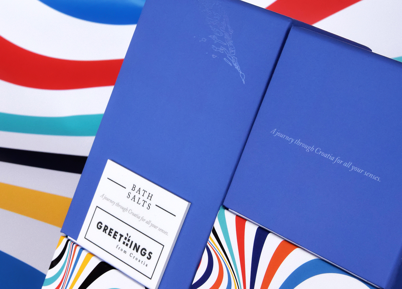
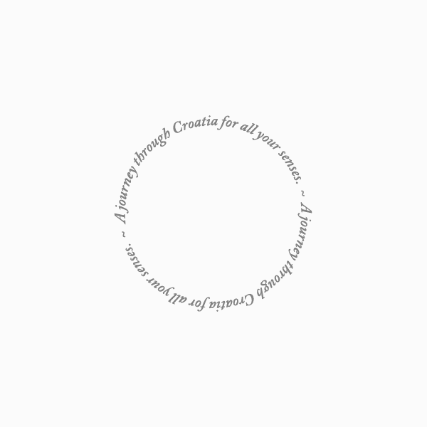
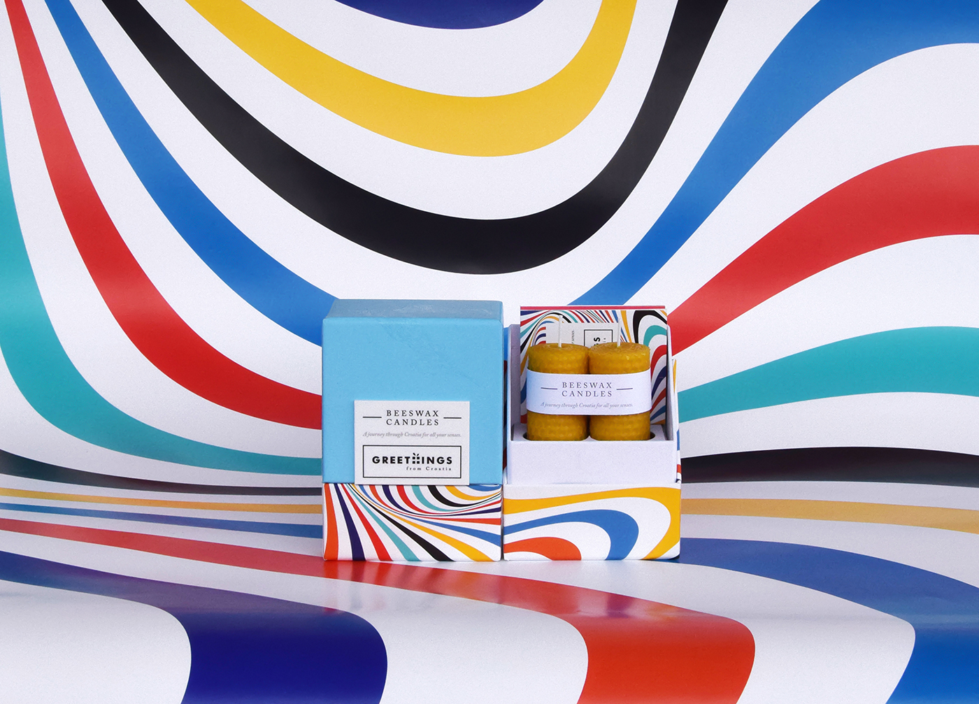
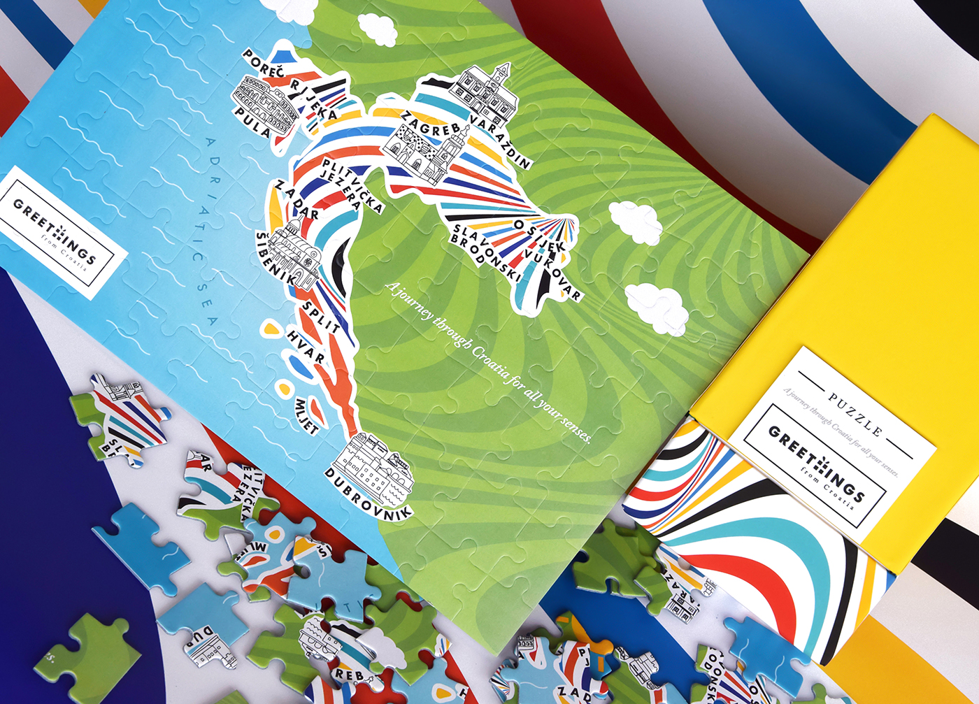
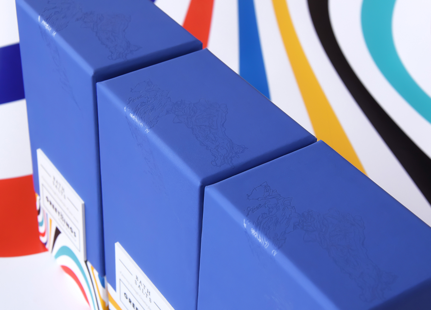
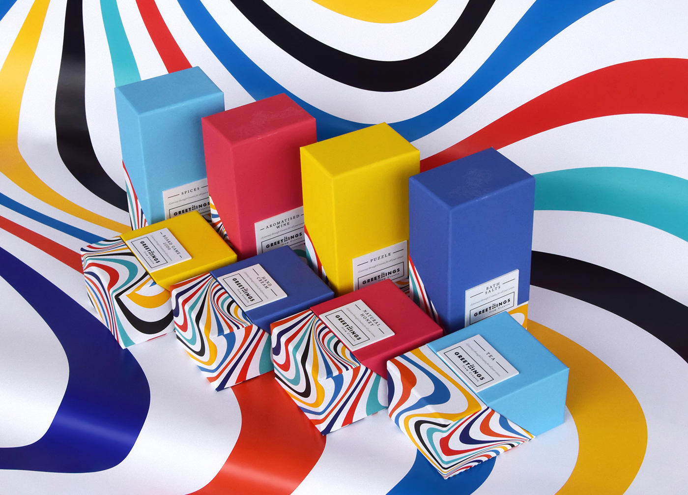
PROJECT / Greethings from Croatia /
GreeThings from Croatia is a brand which collects best of domestic Croatian products which induce all senses. The series contain more than 20 products (and growing) such as aromatised wine, liqueurs, spices, bath salts, tea and many more. Every product is originaly made in Croatia and packed in GreeThings boxes which makes them the perfect souvenir.
When we talk about the complete Croatian experience, this concept is rooted in the fusion of two words: CROATIA and EXPERIENCE. This signifies that GreeThings isn't merely a souvenir but a product that encapsulates both the intangible (the experience, emotions) and the tangible (the product, gift) aspects of Croatia. Read more here or here.
*nominated in ZGDW Award (an international design award presented annually by the Zagreb Design Week, Croatian design festival)
*nominated in ZGDW Award (an international design award presented annually by the Zagreb Design Week, Croatian design festival)


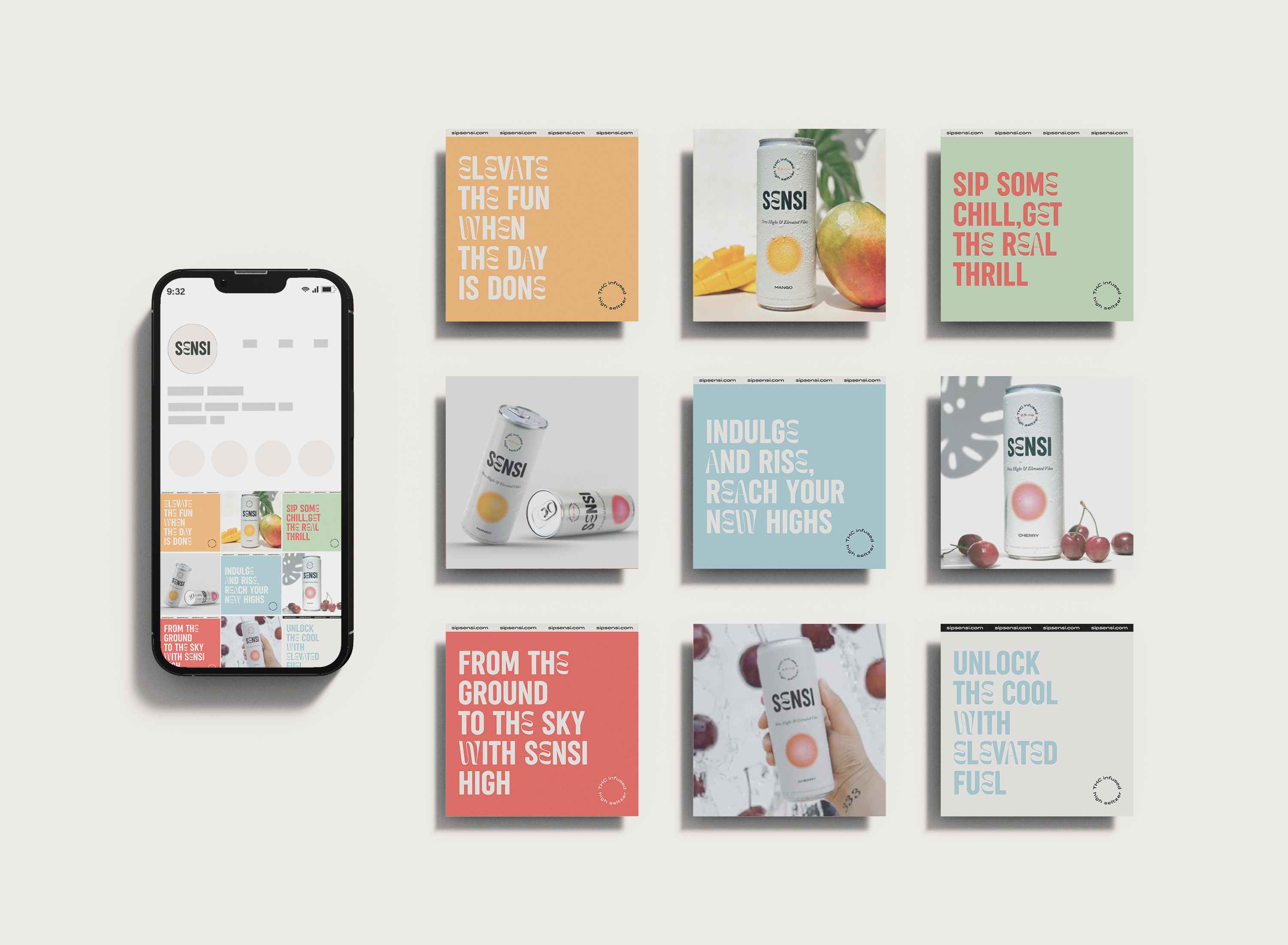
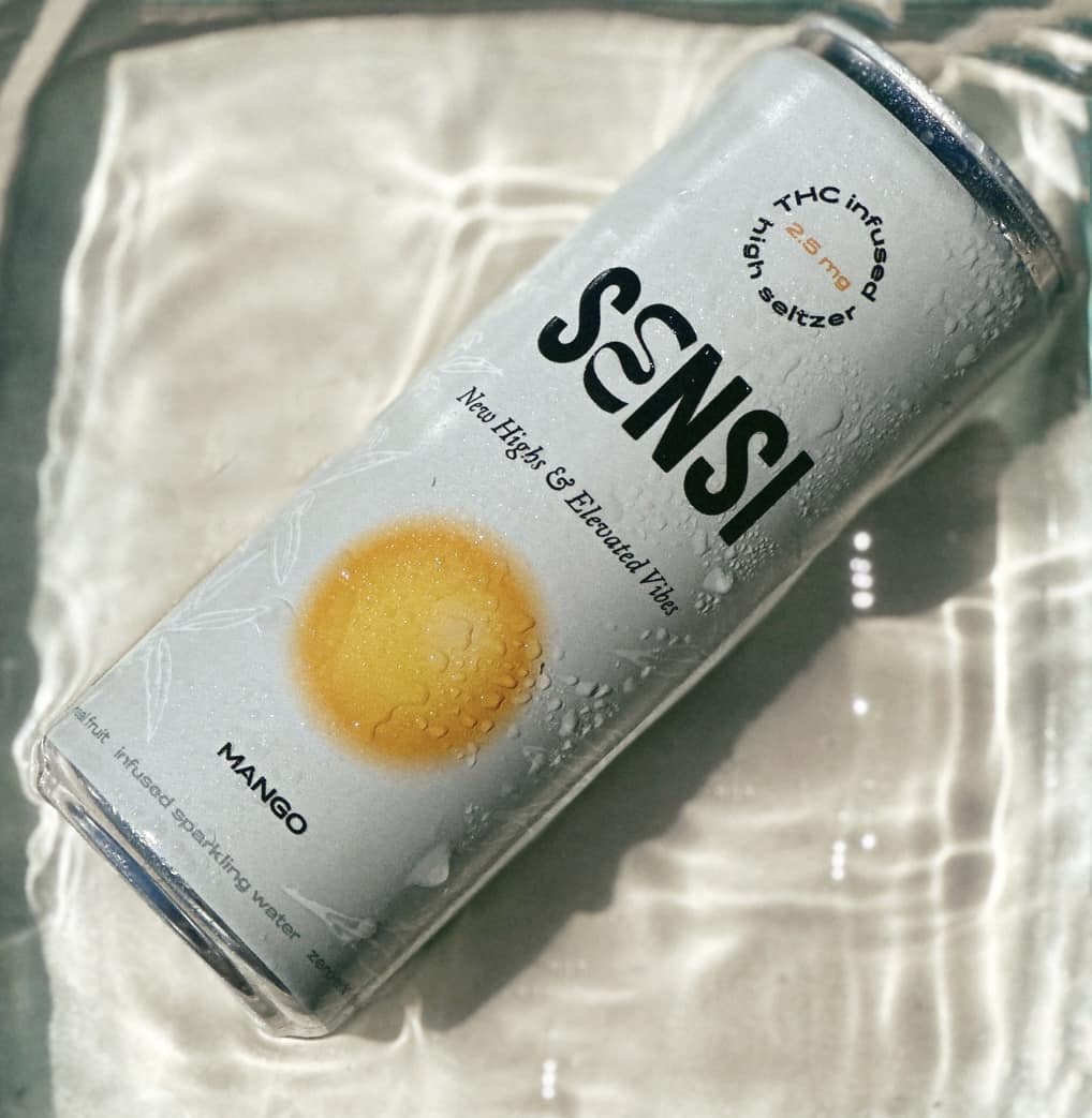
PROJECT / SENSI-NEW HIGHS & ELEVATED VIBES/
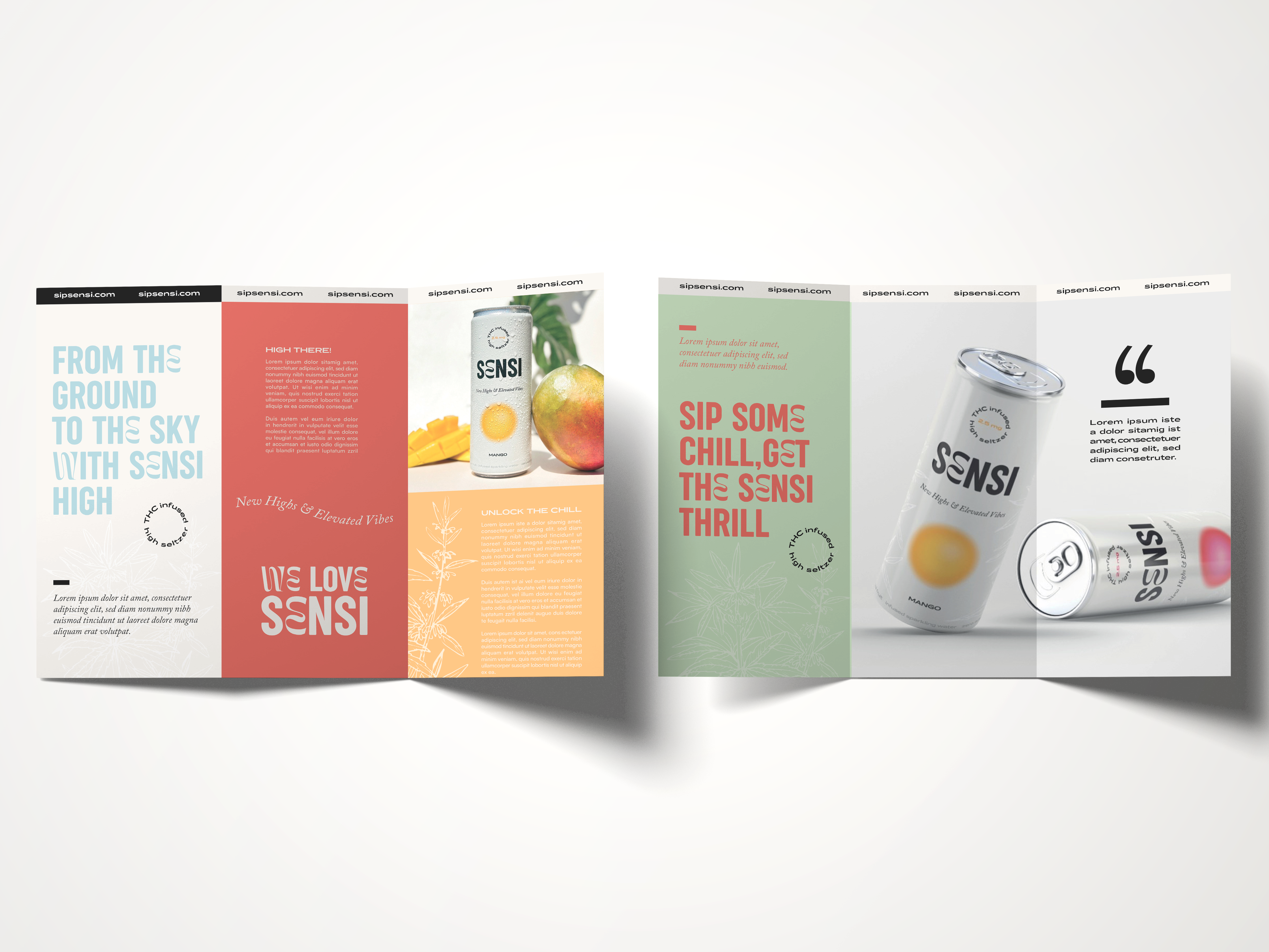
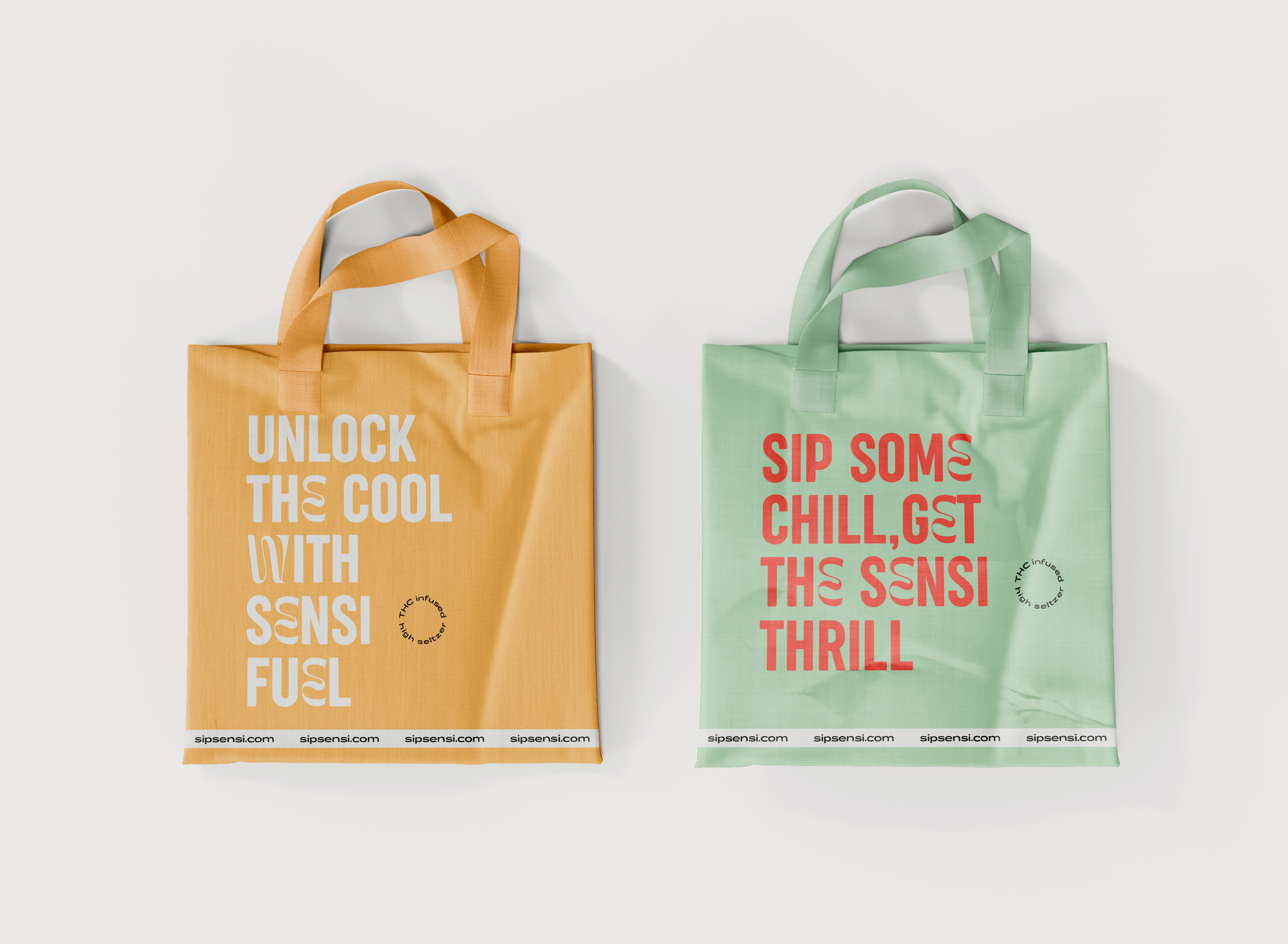
Sensi is a cool, innovative, and adventurous brand that encourages consumers to embrace the extraordinary. With a forward-thinking mindset, Sensi empowers individuals to curate their own moments of elevation and invites them to embark on a sensory journey of taste and exploration.
Sensi was created to provide consumers an enjoyable way to experience the benefits of THC in a refreshing beverage. The goal behind creating Sensi High Seltzer was to offer a product that allows individuals to embrace the perfect amount of "elevation" in a convenient and controlled manner.
Sensi aims to create an immersive brand experience that reflects the commitment to elevated refreshment. Through engaging marketing campaigns, positive communication, impactful packaging, and consistent product excellence, it aims to create a lasting impression and build strong brand loyalty among the target audience.

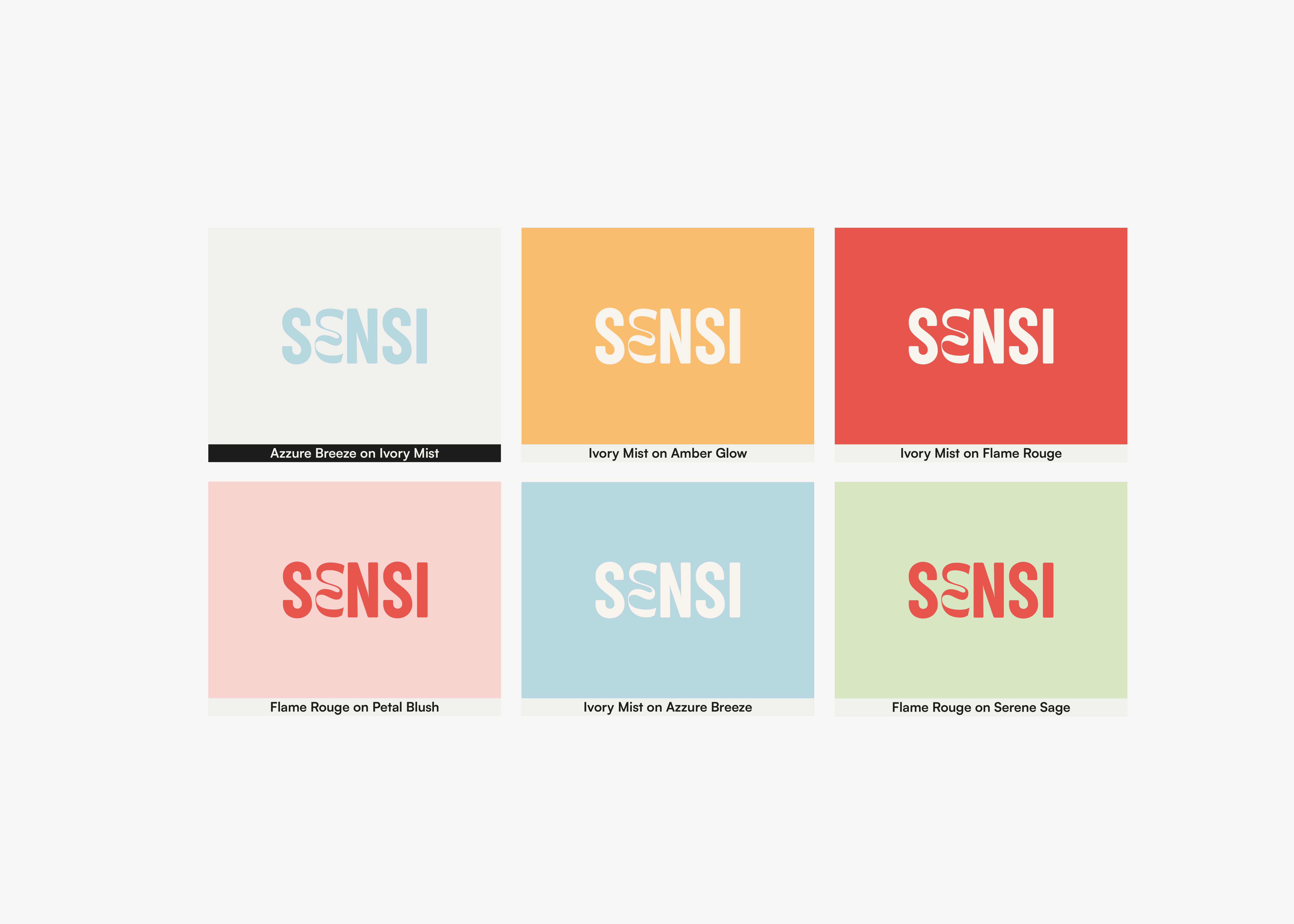
Sensi's visual identity reflects brands personality, with sleek and modern design elements that convey sophistication and a sense of coolness, relaxation and adventure. The color palette, typography, and imagery evoke a feeling of elevated refreshment and natural allure.
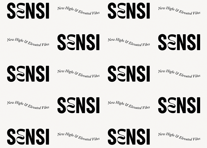

Brand’s tone of voice is confident, vibrant, and engaging. Sensi communicates with a sense of excitement, using language that conveys the joy of indulgence, and the enthusiasm for exploration.


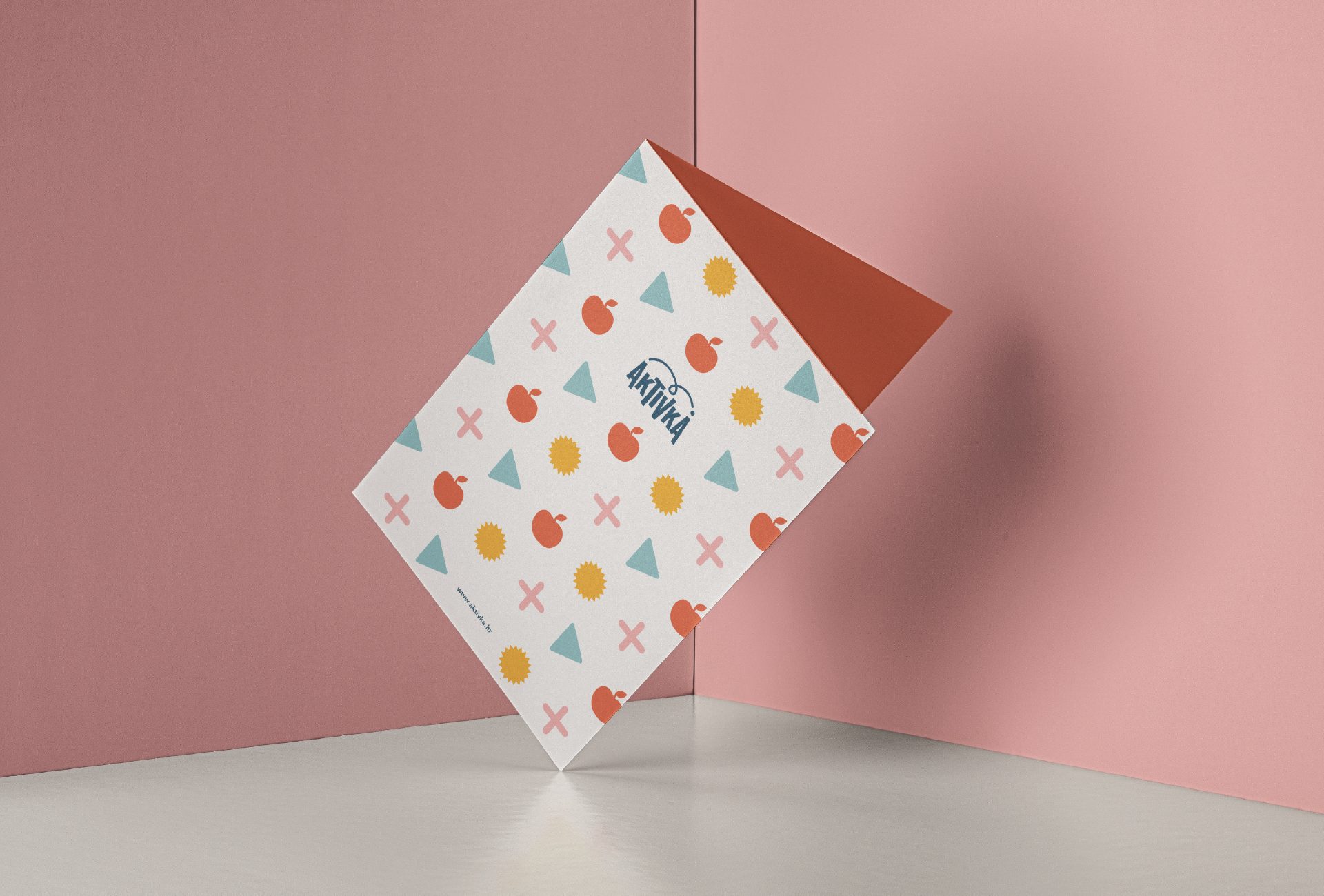
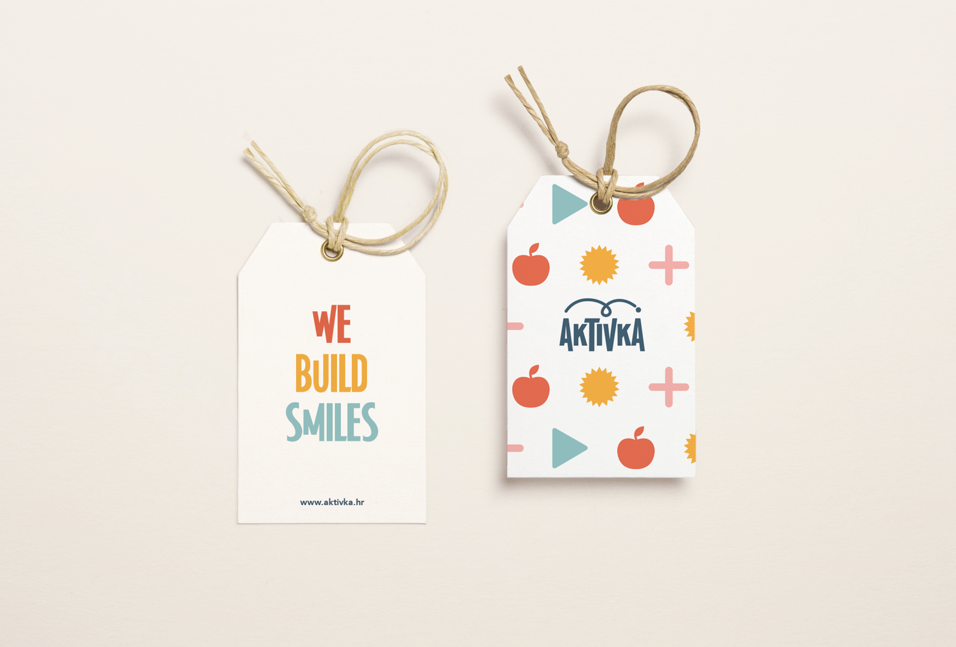
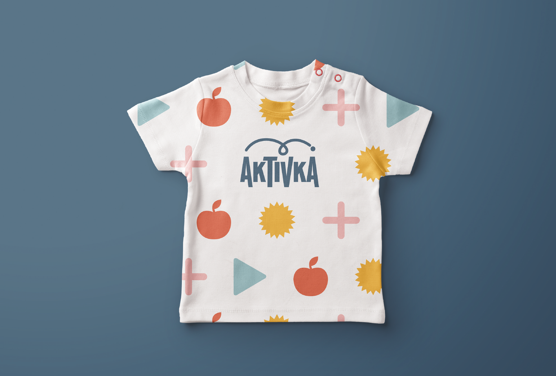
PROJECT / AKTIVKA
The Aktivka brand aims to unlock opportunities for play, engagement, learning, creativity, inquisitiveness, quality growth, progress, and exploration of the rich Croatian heritage and natural beauty. The brand's name embodies the core concept of enriching leisure time by engaging in diverse activities that foster a child's development and education.
It nurtures curiosity for acquiring new knowledge and making discoveries, both about oneself and the surroundings, all while embracing play, problem-solving, navigation, and exploration. The visual identity of the brand characterizes the Aktivka world as modern, inviting, warm, friendly, dynamic, intelligent, educated, and cultured.
The Aktivka logo's design concept is inspired by the brand's name, derived from "activity." This name not only reflects children's playful nature but also invites engagement in various activities offered through its products. The typography conveys the brand's dynamic character, leaning towards illustration in its visual style. Additionally, a complementary graphic element represents key brand values, such as activity, dynamism, playfulness, freedom, creativity, progress, goal achievement, and exploration.
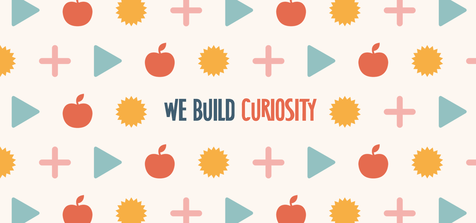
The tagline "We build..." incorporates essential words like "WE" (highlighting community and a shared purpose between the brand and its customers), "BUILD" (representing progress, and growth), and it is followed by a sequence of positively associated terms that reflect the brand's objective. This objective is centered around generating customer satisfaction and creating a fulfilling experience for the user.
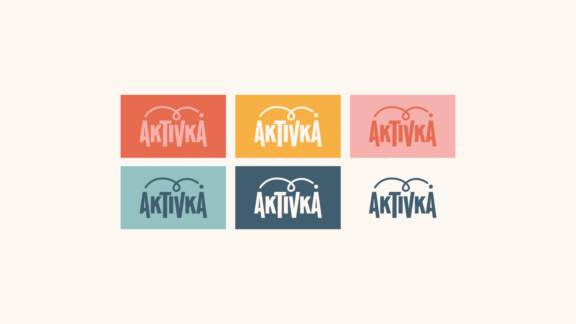
Aktivka's color palette comprises hues that evoke a pleasant, warm, and friendly ambiance, which the brand aims to convey. For this reason, the primary chosen colors are subtly pastel and unobtrusive but give off an impression of liveliness, warmth, cheerfulness, and playfulness. The background "milky" color connects them and contributes to a warmer visual atmosphere. In selecting these colors, care was taken to strike a balance between colors suitable for both girls and boys, ensuring that the brand visually appeals to both groups. By crafting a robust color palette, the brand shapes its personality, making color its primary means of communication and recognition.

The brand pattern is designed using icons, which function as a universal language understood by all, their meanings and associations remaining clear regardless of linguistic variations. These icons are integrated into the pattern to effectively communicate the core concepts that the brand represents in its communication. Additionally, they emphasize the crucial principle of striking the ideal balance in stimulating activities for a child's development, which lies at the heart of Aktivka and its products.


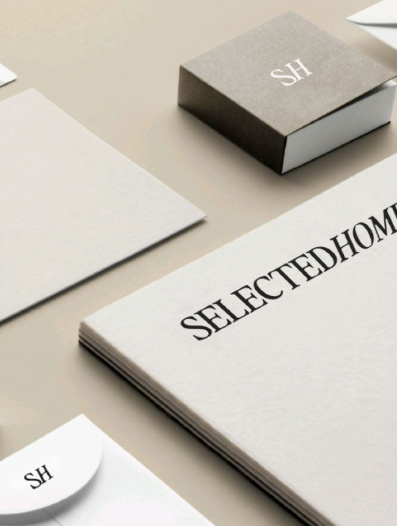
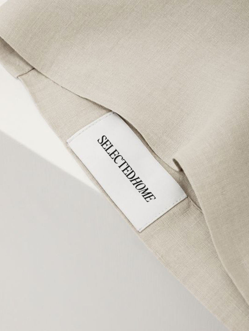
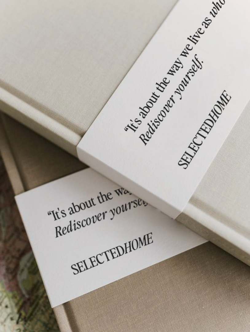
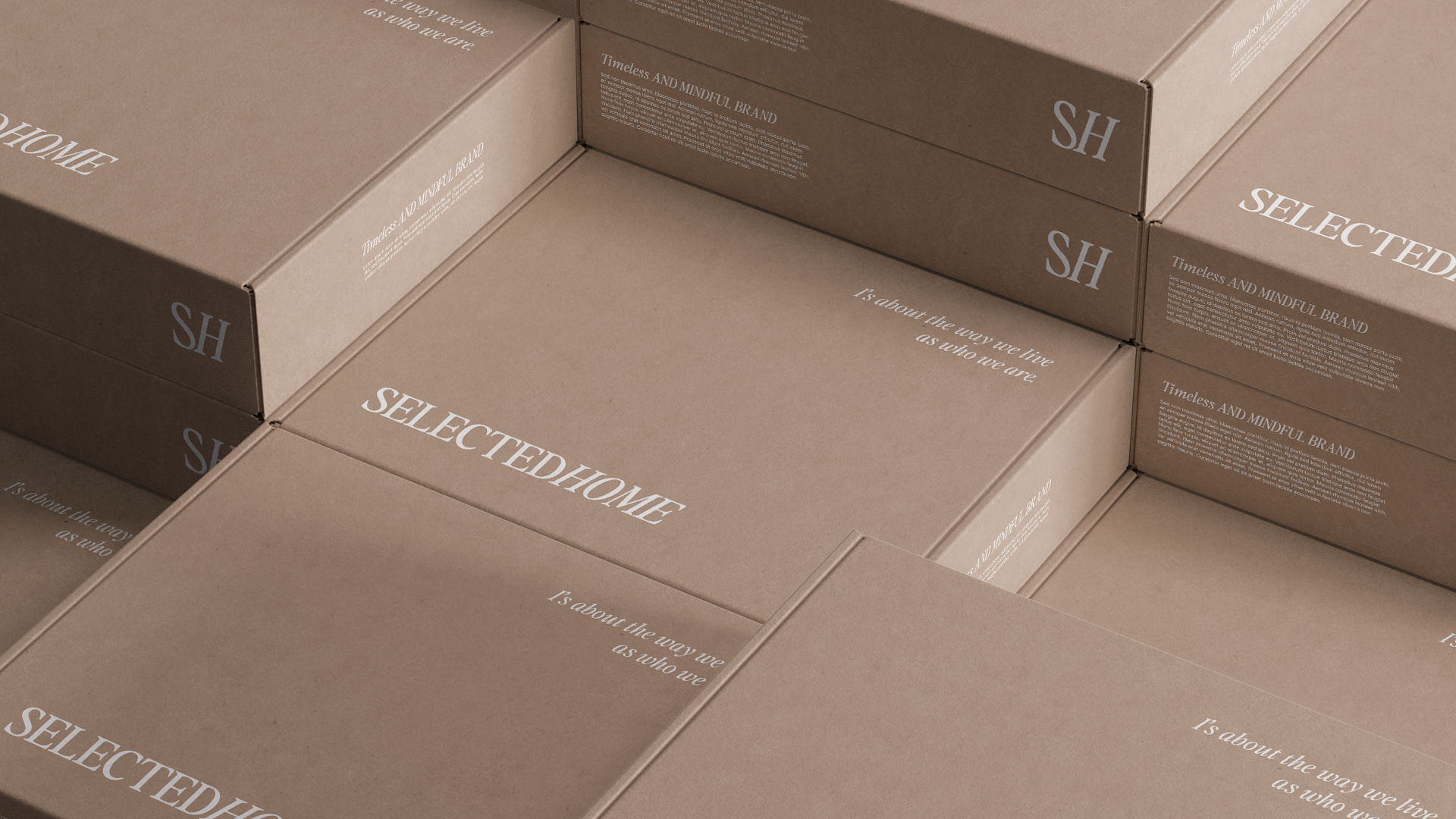
PROJECT / SELECTEDHOMEHOME
SelectedHome is a brand dedicated to providing premium home and lifestyle products. Its primary objective is to establish an inviting, cozy, and timeless ambiance while promoting a conscientious and harmonious way of life. The brand primarily caters to self-assured and accomplished women who possess discerning tastes. These individuals seek simplicity, affordable luxury, modernity, and meticulously curated products to enhance their living experience.
SelectedHome strives for subtle and motivating interaction with customers who value deliberate and logical choices across all facets of their lives. Their goal is to create a high-quality and tranquil living environment that aligns seamlessly with human nature, ultimately fostering a sense of contentment and well-being.
The logo, featuring the brand name, serves as the primary visual representation, crucial for brand recognition across communication channels. The logo concept emphasizes the balance between rational and emotional dimensions, essential for customers who consider both aspects when making decisions about purchases and creating harmonious living spaces. In the brand name, words are not separated by spaces but differentiated by their nature (regular/italic), reflecting a mature, balanced person. This combination within the timeless serif font symbolizes the harmonious union of emotional and rational dimensions for a healthy and content experience.

The brand's color scheme encompasses Deep Charcoal, a distinctively strong and enduring blackish-gray shade, as well as Warm Mist, which exudes warmth and tranquility. These colors, when combined with Off White as the neutral base, emphasize the brand's simplicity and purity. For added versatility and to enhance the brand's character, Light Clay has been introduced. This hue contributes to brand recognition while infusing warmth, comfort, and balance. In addition to the core color palette, accent tones have been incorporated to enhance the brand's ambiance and reinforce the themes of naturalness, warmth, and comfort. The calming True Olive and the more vibrant Terracotta create a harmonious contrast, collectively embodying a sense of natural harmony and complementing each other seamlessly.


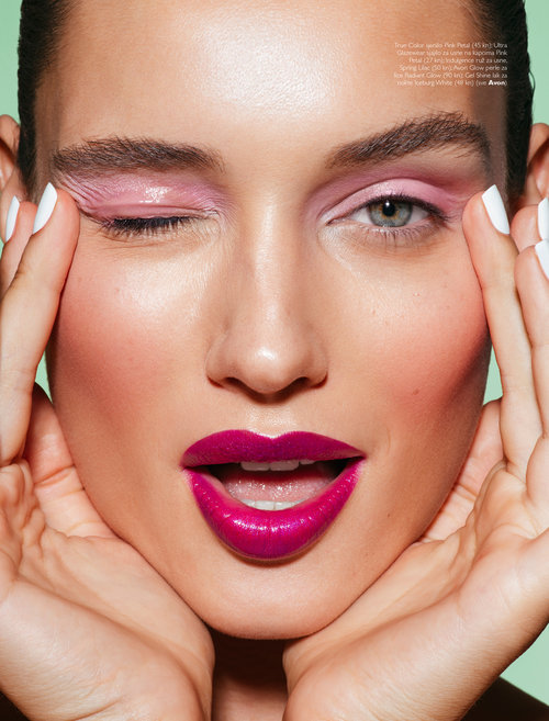
PROJECT / Dajana Pajkic visual identity
Dajana Pajkić is a highly skilled makeup artist with more than ten years of industry expertise, consistently ranked among the most in-demand makeup artists in the region. Explore her work here. As a testament to her unique brand identity, Dajana has cultivated a distinctive monogram logo. This logo is a fusion of her initials, encapsulating her individuality and style as a makeup artist. It serves as a symbol of her professional persona, reflecting her commitment to excellence and creativity in the world of beauty.
Furthermore, her attention to detail extends to her business cards, which are meticulously crafted using smooth, soft-touch coated paper. These cards are adorned with exquisite silver foil accents, much like the way perfect skin radiates a subtle and sophisticated elegance. In mirroring the sheen of a mirror's surface, they encapsulate the essence of her craft – a fusion of skill, artistry, and a commitment to helping individuals look and feel their best.